Design Principles for a Successful Post-Pandemic Public Realm
Date
July 23, 2020To my mind, there are six key factors that maximize the successful adaptation of public space to unexpected circumstances:
1. Polyfunctionality
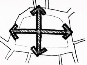
Rather than specialization, the public domain needs to be designed, as much as possible, as an isotropic space. It must work for multiple uses either consecutively or at the same time, including uses that may not be needed today or may not yet exist. Think of car circulation space converted into bike lanes, pop-up testing facilities, or outdoor dining. Spaces do not need to cater to all possible uses but should have a broad enough functional bandwidth to be resilient.
 2. Loose fit
A public space, be it a park or a sidewalk, needs to have generous enough dimensions to flexibly adapt to changing and evolving requirements. Whoever has designed a street cross section knows that the possibilities increase exponentially relative to the available right-of-way width — there’s only so much a 6-foot sidewalk can accomplish in terms of functional flexibility. However, oversizing must be carefully considered. To avoid barren, impersonal spaces, places need to be designed so that “they work for one or for 10,000,” as Jan Gehl reminds us.
 3. Redundancy
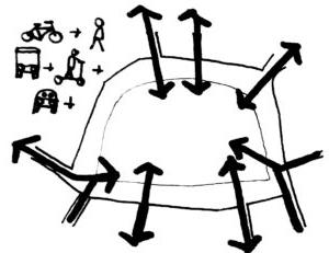
A critical aspect for adaptability and resilience is the ability to provide access, circulation, and servicing from multiple locations. If you can only move along one route, or if you can only hook up to water or electricity at one location, the ability to quickly respond to changing circumstances is severely limited. To limit the extra cost of doubling up circulation and servicing, paths can be shared across multiple modes, and services can be clustered and provided only at strategic locations, for example, where paths cross or at obvious area boundaries.
 4. Access at all levels
Access to space is multidimensional. First, the place needs to provide multiple ways to get in and out, facilitating circulation and, if needed, separating user flows. Second, access has to do with temporal proximity; a multimodal approach is essential to make the space convenient and safely accessible for as many people as possible within a short ‘walk/roll/ride’ time shed. Finally, access requires universal accessibility principles for people with all abilities, but also special access to many types of vehicles, as required by special conditions.
 5. Modularity
A public space also needs to be modular in order to be easily partitioned or closed off, particularly in cases of public safety — think of a flood-prone area like informal soccer fields in many Latin American favelas or a space that can be converted for pandemic testing or outdoor queuing. But modularity is also important to allow the space to dynamically change, i.e., the temporal shrinkage and growth of spaces for specific uses given unique circumstances, for example the need for more outdoor dining areas given health concerns and public behaviours or preferences.
 6. Signaling
Finally, the different areas and elements of a public space need to be easily identifiable by the public and the authorities so there is symmetry of information regarding expected behaviour. While technology can certainly inform users about distancing and use in space, the intuitive conveyance of areas or sectors by simple design tools such as paint, patterns and materials should not be underestimated. It is much more complicated to tell people to not be too close together than to unequivocally show what that means. The ‘physical distancing’ circles painted recently in Domino Park in Williamsburg, New York City, is an obvious example of this (of course, the design intervention does not always need to be so literal.)
Oliver Hartleben is a city planner with a public administration degree from the Harvard Kennedy School focused on existing and evolving public outreach, demographic, mobility, built form, and innovation topics.
A lateral thinker by nature, Oliver brings together his experience in engaging public, private and community stakeholders for the identification of new opportunities and synergies. Oliver is NCI System-certified to facilitate design charettes, has experience in conducting online engagement processes, and leads IBI Group’s R&D Unit, TH!NK.


